Custom Viewport & Device Emulation
A website doesn't look the same at every screen size. Open any modern site on a 27-inch monitor and then pull up the same URL on your phone. Different layout, different navigation, different images, sometimes completely different content. Responsive design means the page adapts to whatever viewport it's given, and a screenshot API captures exactly what fits inside that viewport.
The default capture size is 1280×800 pixels — a standard laptop screen. That's fine for most use cases. But if you're building a link directory that needs mobile thumbnails, running visual regression tests across breakpoints, or archiving how a page looks on a specific device, the default viewport won't cut it. You need to tell the API exactly what screen to simulate.
width and height set the viewport in pixels. device switches between desktop, mobile, and tablet with real user agents and touch emulation. retina doubles the pixel density for high-DPI output. Between them, you can reproduce any screen your users actually see.
Why viewport size matters for screenshots
Responsive design isn't cosmetic — it changes what's on the page. A three-column product grid on desktop becomes a single scrollable column on mobile. The desktop navigation bar collapses into a hamburger menu. A hero banner that fills 500 vertical pixels on a wide screen might shrink to 200 on a phone, or get replaced by a completely different image.
If you capture a responsive site at the wrong viewport, you're not getting a "slightly different" screenshot. You're getting a screenshot of a different layout. For visual regression testing, that means false positives on every run. For archiving, it means you captured a version of the page that most of your users never see.
The viewport also affects how JavaScript behaves. Some sites lazy-load different image sizes based on window.innerWidth. Others show or hide entire sections. A dashboard might switch from a chart view to a list view below 768px. The screenshot reflects all of these decisions, because the page genuinely responds to the viewport size you set.
Setting width and height
Pass width and height as integers. Both are in pixels. Width ranges from 320 to 3840, height from 200 to 2160.
curl -X POST https://screenshotrun.com/api/v1/screenshots \
  -H "Authorization: Bearer YOUR_API_KEY" \
  -H "Content-Type: application/json" \
  -d '{
    "url": "https://example.com",
    "width": 1920,
    "height": 1080
  }'
This captures a full HD viewport — what a user on a 1080p monitor sees. The output image is 1920×1080 pixels (unless full_page extends the height, or retina doubles both dimensions).
If you omit both parameters, the API defaults to 1280×800. Omit just one and the other still uses its default: "width": 1920 alone produces a 1920×800 capture.
Common viewport sizes for real devices
These are the viewport dimensions I use most often in production. They match real device screens, not arbitrary round numbers:
| Device / Screen | Width | Height | Use case |
|---|---|---|---|
| iPhone SE | 375 | 667 | Smallest common phone |
| iPhone 14/15 | 390 | 844 | Standard iPhone |
| iPhone 14/15 Pro Max | 430 | 932 | Large phone |
| Samsung Galaxy S24 | 360 | 780 | Standard Android |
| iPad Mini | 744 | 1133 | Small tablet |
| iPad Air / Pro 11" | 820 | 1180 | Standard tablet |
| Laptop (default) | 1280 | 800 | API default |
| Full HD monitor | 1920 | 1080 | Desktop standard |
| QHD / 2K monitor | 2560 | 1440 | Developer monitors |
| 4K / Ultra HD | 3840 | 2160 | Max supported |
For visual regression testing, I typically test at three breakpoints: 375 (mobile), 768 (tablet), and 1280 (desktop). That covers the three layouts most responsive sites define.
Mobile and tablet screenshots with device emulation
Setting width to 375 gives you a narrow viewport, but the page still thinks it's running in a desktop browser. The user agent says Chrome on Windows, navigator.maxTouchPoints returns 0, and CSS media queries for hover: hover fire as if a mouse is present. Some sites use these signals to decide which layout to serve, so a narrow viewport alone isn't enough to get the true mobile experience.
Here's the same page — Stripe's homepage — captured at two different viewport sizes. The layout, navigation, and even the content hierarchy change completely:
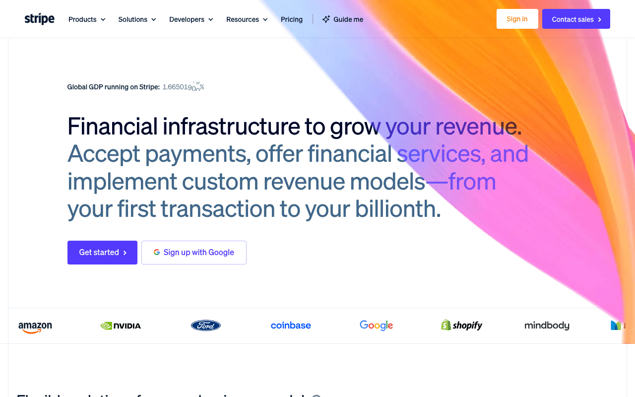
Now the same URL at 375px width with mobile device emulation — notice the hamburger menu, stacked layout, and full-width buttons:

The device parameter handles the full emulation:
{
  "url": "https://example.com",
  "device": "mobile"
}
This sets the viewport to 375×812, switches the user agent to Safari on iPhone, enables touch emulation (isMobile: true), and applies a 2x device pixel ratio automatically. The page receives all the same signals a real iPhone would send. Tablet mode does the same at 768×1024 with an iPad user agent.
When device is set to mobile or tablet, custom width and height values are ignored — the preset dimensions are used instead. This is intentional: the device preset is a package deal (viewport + UA + touch + scale), and mixing custom dimensions with a mobile user agent produces inconsistent results. For a custom-sized mobile viewport, use "device": "desktop" with your own dimensions and set user_agent manually.
Device emulation is available on Starter plans and above. The free tier captures at any viewport size using width and height, but without device-specific user agents and touch emulation. For a deeper look at mobile-specific captures, see the iPhone, iPad, and Android screenshot guide.
Retina screenshots at 2x resolution
On a regular display, one CSS pixel equals one physical pixel. On a retina or high-DPI display, one CSS pixel maps to four physical pixels (2×2). Text is sharper, icons are crisper, and images that look fine on a standard display suddenly look blurry on retina because they don't have enough pixels to fill the space.
The retina parameter tells the renderer to use a 2x device pixel ratio:
{
  "url": "https://example.com",
  "width": 1280,
  "height": 800,
  "retina": true
}
Here's the difference in practice. Both screenshots show GitHub Trending at the same 800×500 viewport — but the retina version renders at double the pixel count:
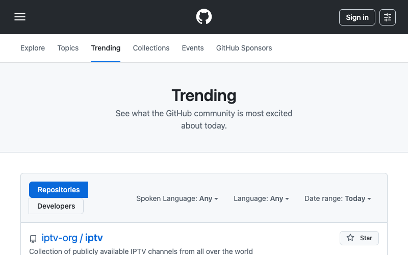
And the same page at 2x — text, icons, and UI elements are noticeably sharper:

The viewport stays 1280×800 (CSS pixels), but the output image is 2560×1600 (physical pixels). The page renders exactly the same layout — no responsive breakpoints trigger — but every element is rendered at double resolution. Text and SVGs are sharper. Raster images may appear the same or better, depending on whether the site serves srcset alternatives.
The tradeoff is file size. A retina PNG can be 3–4x larger than the 1x version. Switch to WebP or AVIF to cut that back. The full-page screenshot guide has a format comparison table with typical sizes.
Mobile and tablet device presets include 2x scale automatically, so you don't need to set retina: true when using "device": "mobile". Retina as a standalone parameter is available on Starter plans and above.
Resizing after capture
Sometimes you need the page to render at one size but the output image at another. A link directory wants to display 200px-wide thumbnails, but capturing at 200px viewport produces a broken layout — the site was never designed for that width.
Capture at full size, then resize:
{
  "url": "https://example.com",
  "width": 1280,
  "height": 800,
  "resize_width": 400
}
The renderer captures at 1280×800, then scales the image down to 400px wide (height adjusts proportionally). The layout is correct because the page rendered at a real viewport size. The output is small because the resizing happened after capture.
You can also set resize_height alone or both together. The image fits inside the specified dimensions while maintaining aspect ratio. Images are never enlarged — if the original is smaller than the resize target, it stays as-is. Combine with retina for thumbnails that look sharp on high-DPI screens: capture at 2x, resize down to 1x dimensions, and the extra pixels make the thumbnail crisp even at small sizes.
Responsive breakpoints and what breaks at each one
Every responsive site has breakpoints — viewport widths where the layout shifts. If you're capturing screenshots across multiple sizes, these are the widths where things actually change:
320–375px (small phones): single column, hamburger menu, images stack vertically. Some sites show entirely different content here — simplified navigation, fewer CTAs, mobile-specific banners. This is the hardest size to get right in screenshots because SPAs often have separate mobile rendering paths that take longer to load.
768px (tablet / iPad portrait): usually the first "medium" breakpoint. Two-column layouts appear, sidebars may return, navigation partially expands. Many sites still use 768px as their primary tablet breakpoint even though modern iPads have wider viewports.
1024px (tablet landscape / small desktop): most sites switch to their full desktop layout here. Three-column grids, full navigation, desktop-width heroes. If the site only has two breakpoints (mobile/desktop), this is usually where the desktop layout kicks in.
1280px (standard desktop): the API default. Most dashboards, admin panels, and content sites are designed primarily for this width. Safe choice when you don't know the site structure.
1920px+ (wide monitors): some sites stretch to fill; others cap their content width and center it. A screenshot at 1920 might just have more whitespace on the sides. For sites with max-width containers, there's no visual difference between 1440 and 1920.
Viewport height vs full-page height
The height parameter sets the initial viewport. Without full_page, the captured image is exactly this tall. With full_page: true, the height extends to the full scrollable area of the page, regardless of the viewport height you set.
{
  "url": "https://example.com",
  "width": 1280,
  "height": 800,
  "full_page": true
}
In this case, the viewport starts at 1280×800, the page renders inside that viewport (triggering its 1280px-width breakpoint), and then the capture extends to the full document height — maybe 4000 pixels, maybe 12000. The width stays at 1280. Details on how this works and the edge cases in the full-page screenshot guide.
Why does viewport height matter if full_page overrides it? Because some sites use vh units and window.innerHeight for layout calculations. A hero section set to 100vh renders as 800px tall with the default height, or 1080px tall if you set "height": 1080. The full-page capture includes both cases, but the proportions differ. For lazy-loaded images, a taller viewport also means more content loads on the initial render before the scroll-and-capture cycle begins.
The Puppeteer approach vs two parameters
Here's the Puppeteer equivalent of capturing at a custom viewport with device emulation:
const browser = await puppeteer.launch();
const page = await browser.newPage();

await page.setViewport({
  width: 375,
  height: 812,
  deviceScaleFactor: 2,
  isMobile: true,
  hasTouch: true,
});

await page.setUserAgent(
  'Mozilla/5.0 (iPhone; CPU iPhone OS 17_0 like Mac OS X) ' +
  'AppleWebKit/605.1.15 (KHTML, like Gecko) Version/17.0 ' +
  'Mobile/15E148 Safari/604.1'
);

await page.goto('https://example.com', {
  waitUntil: 'networkidle0'
});

const screenshot = await page.screenshot();
await browser.close();
Fifteen lines to do what "device": "mobile" does in one parameter. And this doesn't include error handling, browser lifecycle management, or the Chromium dependency. For a full breakdown of when self-hosting makes sense, see the build vs buy comparison.
Parameter quick reference
Full details in the API reference. Here's the viewport-specific subset:
| Parameter | Type | Default | Range | Plan |
|---|---|---|---|---|
width | integer | 1280 | 320–3840 px | All (incl. Free) |
height | integer | 800 | 200–2160 px | All (incl. Free) |
device | string | desktop | desktop, mobile, tablet | Starter+ |
retina | boolean | false | — | Starter+ |
resize_width | integer | — | 16–3840 px | All (incl. Free) |
resize_height | integer | — | 16–2160 px | All (incl. Free) |
user_agent | string | Chrome UA | Any valid UA | All (incl. Free) |
Custom width and height are the foundation — available on every plan, any viewport from phone to 4K. Device emulation and retina add the signals that make sites respond as if a real device is visiting. Between them, you can capture exactly what any user sees on any screen.